Solutions
(1) We begin by building the three models on the training data and saving the results in an Rdata file.
linmod <- rxLinMod(tip_percent ~ payment_type + pickup_nb:dropoff_nb + pickup_dow:pickup_hour,
                   mht_split$train, reportProgress = 0)
dtree <- rxDTree(tip_percent ~ payment_type + pickup_nb + dropoff_nb + pickup_dow + pickup_hour,
                 mht_split$train, pruneCp = "auto", reportProgress = 0)
dforest <- rxDForest(tip_percent ~ payment_type + pickup_nb + dropoff_nb + pickup_dow + pickup_hour,
                     mht_split$train, nTree = 10, importance = TRUE, useSparseCube = TRUE, reportProgress = 0)

trained.models <- list(linmod = linmod, dtree = dtree, dforest = dforest)
save(trained.models, file = 'trained_models_2.Rdata')
(2) We can now build a prediction dataset with all the combinations of the input variables. If any of the input variables was numeric, we would have to discretize it so the dataset does not blow up in size. In our case, we don't have numeric inputs. Finally, with do.call we can recursively join the predictions to the original data using the cbind function.
rxs <- rxSummary( ~ payment_type + pickup_nb + dropoff_nb + pickup_hour + pickup_dow, mht_xdf)
ll <- lapply(rxs$categorical, function(x) x[ , 1])
names(ll) <- c('payment_type', 'pickup_nb', 'dropoff_nb', 'pickup_hour', 'pickup_dow')
pred_df <- expand.grid(ll)
pred_df_1 <- rxPredict(trained.models$linmod, data = pred_df, predVarNames = "pred_linmod")
pred_df_2 <- rxPredict(trained.models$dtree, data = pred_df, predVarNames = "pred_dtree")
pred_df_3 <- rxPredict(trained.models$dforest, data = pred_df, predVarNames = "pred_dforest")
pred_df <- do.call(cbind, list(pred_df, pred_df_1, pred_df_2, pred_df_3))
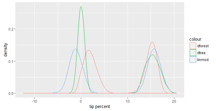
(3) We now feed the above data to ggplot to look at the distribution of the predictions made by each model. It should come as no surprise that with the inclusion of payment_type the predictions have a bimodal distribution one for trips paid in cash and one for trips paid using a card. For trips paid in cash, the actual distribution is not as important, but for trips paid using a card we can see that the random forest model makes predictions that are less spread out than the other two models.
ggplot(data = pred_df) +
  geom_density(aes(x = pred_linmod, col = "linmod")) +
  geom_density(aes(x = pred_dtree, col = "dtree")) +
  geom_density(aes(x = pred_dforest, col = "dforest")) +
  xlab("tip percent") # + facet_grid(pickup_hour ~ pickup_dow)
(4) We now run the predictions on the test data to evaluate each model's performance. To do so, we use rxPredict without the outData argument and make an assignment on the left side so results would go into a data.frame.
test_df <- rxXdfToDataFrame(mht_split$test, varsToKeep = c('tip_percent', 'payment_type', 'pickup_nb', 'dropoff_nb', 'pickup_hour', 'pickup_dow'), maxRowsByCols = 10^9)
test_df_1 <- rxPredict(trained.models$linmod, data = test_df, predVarNames = "tip_pred_linmod")
test_df_2 <- rxPredict(trained.models$dtree, data = test_df, predVarNames = "tip_pred_dtree")
test_df_3 <- rxPredict(trained.models$dforest, data = test_df, predVarNames = "tip_pred_dforest")
test_df <- do.call(cbind, list(test_df, test_df_1, test_df_2, test_df_3))
head(test_df)
  tip_percent payment_type       pickup_nb         dropoff_nb pickup_hour pickup_dow
1           0         cash        Gramercy   Garment District    10PM-1AM        Fri
2           0         cash         Chelsea            Chelsea    10PM-1AM        Fri
3          24         card Upper East Side            Chelsea    10PM-1AM        Fri
4           0         cash Lower East Side    Lower East Side    10PM-1AM        Fri
5          17         card         Chelsea Financial District    10PM-1AM        Fri
6          12         card Lower East Side       West Village    10PM-1AM        Fri
  tip_pred_linmod tip_pred_dtree tip_pred_dforest
1       0.3208239   0.0002443074         2.226467
2       1.2503461   0.0002443074         1.220008
3      15.6659118  15.8644298583        14.627761
4       0.7529378   0.0002443074         1.063518
5      15.7867789  14.9364630503        15.773411
6      16.2032915  16.2778606733        15.261509
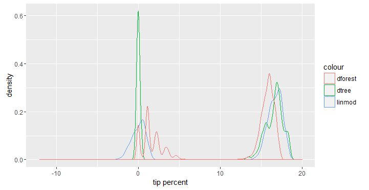
Since we have the test data in a data.frame we can also plot the distribution of the predictions on the test data to compare it with the last plot. As we can see, the random forest and linear model both probably waste some computation effort making predictions for trips paid in cash.
ggplot(data = test_df) +
  geom_density(aes(x = tip_pred_linmod, col = "linmod")) +
  geom_density(aes(x = tip_pred_dtree, col = "dtree")) +
  geom_density(aes(x = tip_pred_dforest, col = "dforest")) +
  xlab("tip percent") # + facet_grid(pickup_hour ~ pickup_dow)
(5) Recall from the last section that the predictions made by the three models had an average SSE of about 80. With the inclusion of payment_type we should see a considerable drop in this number.
rxSummary(~ SSE_linmod + SSE_dtree + SSE_dforest, data = test_df,
          transforms = list(SSE_linmod = (tip_percent - tip_pred_linmod)^2,
                            SSE_dtree = (tip_percent - tip_pred_dtree)^2,
                            SSE_dforest = (tip_percent - tip_pred_dforest)^2))
Summary Statistics Results for: ~SSE_linmod + SSE_dtree + SSE_dforest
Data: test_df
Number of valid observations: 43121727

 Name        Mean     StdDev   Min                Max      ValidObs MissingObs
 SSE_linmod  21.05534 87.48650 0.0000000006167121 8699.937 42949555 172172
 SSE_dtree   22.07582 89.50709 0.0000000063516358 8463.955 43121727      0
 SSE_dforest 24.47603 90.66860 0.0000000005298480 8463.965 43121727      0
The average SSE has now dropped to a little over 20, which confirms how the inclusion of the right features (payment_type in this case) can have a significant impact on our model's predictive power.