Dealing with datetimes
Let's begin by dropping the columns we don't need (because they serve no purpose for our analysis).
nyc_taxi$u <- NULL # drop the variable `u`
nyc_taxi$store_and_fwd_flag <- NULL
Next we format tpep_pickup_datetime and tpep_dropoff_datetime as datetime columns. There are different functions for dealing with datetime column types, including functions in the base package, but we will be using the lubridate package for its rich set of functions and simplicity.
library(lubridate)
Sys.setenv(TZ = "US/Pacific") # not important for this dataset, but this is how we set the time zone
The function we need is called ymd_hms, but before we run it on the data let's test it on a string. Doing so gives us a chance to test the function on a simple input and catch any errors or wrong argument specifications.
ymd_hms("2015-01-25 00:13:08", tz = "US/Eastern") # we can ignore warning message about timezones
[1] "2015-01-25 00:13:08 EST"
We seem to have the right function and the right set of arguments, so let's now apply it to the data. If we are still unsure about whether things will work, it might be prudent to not immediately overwrite the existing column. We could either write the transformation to a new column or run the transformation on the first few rows of the data and just display the results in the console.
ymd_hms(nyc_taxi$tpep_pickup_datetime[1:20], tz = "US/Eastern")
 [1] "2015-01-15 19:05:40 EST" "2015-01-25 00:13:06 EST" "2015-01-25 00:13:08 EST"
 [4] "2015-01-25 00:13:09 EST" "2015-01-04 13:44:52 EST" "2015-01-04 13:44:52 EST"
 [7] "2015-01-04 13:44:53 EST" "2015-01-04 13:44:54 EST" "2015-01-04 13:44:54 EST"
...
We now apply the transformation to the whole data and overwrite the original column with it.
nyc_taxi$tpep_pickup_datetime <- ymd_hms(nyc_taxi$tpep_pickup_datetime, tz = "US/Eastern")
There's another way to do the above transformation: by using the transform function. Just as was the case with subset, transform allows us to pass the data as the first argument so that we don't have to prefix the column names with nyc_taxi$. The result is a cleaner and more readable notation.
nyc_taxi <- transform(nyc_taxi, tpep_dropoff_datetime = ymd_hms(tpep_dropoff_datetime, tz = "US/Eastern"))
Let's also change the column names from tpep_pickup_datetime to pickup_datetime and tpep_dropoff_datetime to dropoff_datetime.
names(nyc_taxi)[2:3] <- c('pickup_datetime', 'dropoff_datetime')
Let's now see some of the benefits of formatting the above columns as datetime. The first benefit is that we can now perform date calculations on the data. Say for example that we wanted to know how many data points are in each week. We can use table to get the counts and the week function in lubridate to extract the week (from 1 to 52 for a non-leap year) from pickup_datetime.
table(week(nyc_taxi$pickup_datetime)) # `week`
     1      2      3      4      5      6      7      8      9     10     11
132218 156165 150257 126590 152008 154602 157913 157475 153304 147552 154425
    12     13     14     15     16     17     18     19     20     21     22
151841 154205 147884 151272 155661 154243 155881 150556 154002 134036 146907
    23     24     25     26
148036 144538 141822 118967
table(week(nyc_taxi$pickup_datetime), month(nyc_taxi$pickup_datetime)) # `week` and `month` are datetime functions
          1      2      3      4      5      6
  1  132218      0      0      0      0      0
  2  156165      0      0      0      0      0
  3  150257      0      0      0      0      0
  4  126590      0      0      0      0      0
  5   71950  80058      0      0      0      0
  6       0 154602      0      0      0      0
  7       0 157913      0      0      0      0
  8       0 157475      0      0      0      0
  9       0  73186  80118      0      0      0
  10      0      0 147552      0      0      0
  11      0      0 154425      0      0      0
  12      0      0 151841      0      0      0
  13      0      0 132364  21841      0      0
  14      0      0      0 147884      0      0
  15      0      0      0 151272      0      0
  16      0      0      0 155661      0      0
  17      0      0      0 154243      0      0
  18      0      0      0  22535 133346      0
  19      0      0      0      0 150556      0
  20      0      0      0      0 154002      0
  21      0      0      0      0 134036      0
  22      0      0      0      0  84904  62003
  23      0      0      0      0      0 148036
  24      0      0      0      0      0 144538
  25      0      0      0      0      0 141822
  26      0      0      0      0      0 118967
Another benefit of the datetime format is that plotting functions can do a better job of displaying the data in the expected format.# (2) many data summaries and data visualizations automatically 'look right' when the data has the proper format. We do not cover data visualization in-depth in this course, but we provide many examples to get you started. Here's a histogram of pickup_datetime.
library(ggplot2)
ggplot(data = nyc_taxi) +
  geom_histogram(aes(x = pickup_datetime), col = "black", fill = "lightblue",
                 binwidth = 60*60*24*7) # the bin has a width of one week
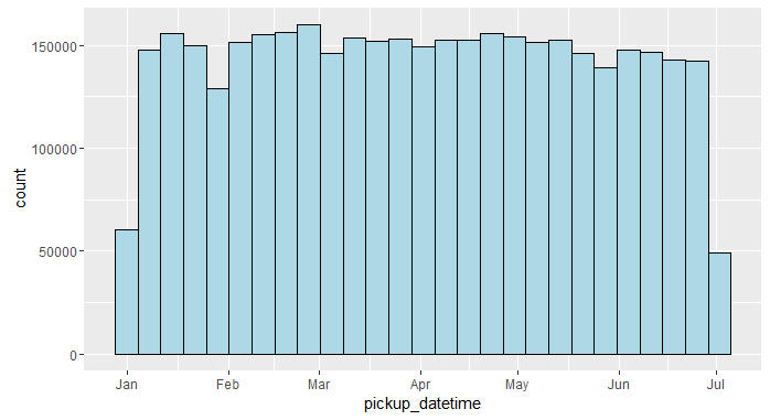
Notice how the x-axis is properly formatted as a date without any manual input from us. Both the summary and the plot above would not have been possible if pickup_datetime was still a character column.