Tipping behavior
We now calculate the tipping percentage for every trip.
nyc_taxi <- mutate(nyc_taxi, tip_percent = as.integer(tip_amount / (tip_amount + fare_amount) * 100))
tprop.table(table(nyc_taxi$tip_percent, useNA = "ifany"))
         0          1          2          3          4          5          6
0.39587168 0.00060872 0.00043817 0.00087115 0.00177891 0.00370604 0.00572869
         7          8          9         10         11         12         13
0.00727164 0.01187921 0.01397818 0.01781712 0.01939823 0.01604185 0.01833810
        14         15         16         17         18         19         20
0.01655114 0.01505596 0.02892329 0.12340195 0.10929866 0.04829479 0.03954094
        21         22         23         24         25         26         27
0.03292058 0.01774937 0.01507646 0.01278436 0.01041465 0.00546704 0.00292911
        28         29         30         31         32         33         34
...
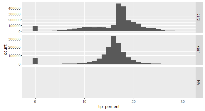
The percentage for people who tipped nothing is a bit suspicious. The above table is useful, but it might be easier for us to see the distribution if we plot the histogram. And since there's a good chance that method of payment affects tipping, we break up the histogram by payment_type.
library(ggplot2)
ggplot(data = nyc_taxi) +
  geom_histogram(aes(x = tip_percent), binwidth = 1) + # show a separate bar for each percentage
  facet_grid(payment_type ~ ., scales = "free") + # break up by payment type and allow different scales for 'y-axis'
  xlim(c(-1, 31)) # only show tipping percentages between 0 and 30
The histogram confirms what we suspected: tipping is affected by the method of payment. However, it is unlikely to believe that people who pay cash simply don't tip. A more believable scenario is that cash customers tip too, but their tip does not get recorded into the system as tip. In the next exercise, we try our hand at simulating tipping behavior for cash customers.
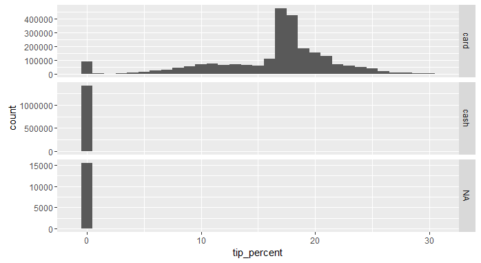
Instead of ignoring tip amount for customers who pay cash, or pretending that it's really zero, in the last exercise we wrote a function that uses a simple rule-based approach to find how much to tipping. In the next exercise, we apply the function to the dataset. But before we do that, let's use an alternative approach to the rule-based method: Let's use a statistical technique to estimate tipping behavior, here's one naive way of doing it:
Since even among card-paying customers, a small proportion don't tip, we can toss a coin and do as follows:
- With 5 percent probability the customer does not tip
- With 95 percent probability the customer tips, and the tip is a certain percentage of the fare amount and a random component. More specifically, the tip is determined by drawing from a normal distribution centered around 20 percent of the fare amount with a standard deviation of 25 cents.
Here's how we can apply the above logic to the dataste:
nyc_taxi <- mutate(nyc_taxi,
                   toss_coin = rbinom(nrow(nyc_taxi), 1, p = .95), # toss a coin
                   tip_if_heads = rnorm(nrow(nyc_taxi), mean = fare_amount * 0.20, sd = .25),
                   tip_if_tails = 0, # if tails don't tip
                   tip_amount =
                     ifelse(payment_type == 'cash',
                            ifelse(toss_coin, tip_if_heads, tip_if_tails), # when payment method is cash apply the above rule
                            ifelse(payment_type == 'card', tip_amount, NA)), # otherwise just use the data we have
                   tip_percent = as.integer(tip_amount / (tip_amount + fare_amount) * 100), # recalculate tip percentage
                   toss_coin = NULL, # drop variables we no longer need
                   tip_if_heads = NULL,
                   tip_if_tails = NULL)
Let's visualize the percentage tipped to for card and cash customers now.
library(ggplot2)
ggplot(data = nyc_taxi) +
  geom_histogram(aes(x = tip_percent), binwidth = 1) + # show a separate bar for each percentage
  facet_grid(payment_type ~ ., scales = "free") + # break up by payment type and allow different scales for 'y-axis'
  xlim(c(-1, 31)) # only show tipping percentages between 0 and 30