Solutions
(1) We want to return one of the elements of upper_limits. Which element we return is dynamically determined by findIntarval, except we need to add 1 to return the upper limit (otherwise the lower limit is returned).
upper_limits[findInterval(0, upper_limits) + 1]
[1] 1
(2) The problem reduces to finding out if findInterval is vectorized. We simply feed a vector, 1:5 in this example, to findInterval and make sure that it returns a vector.
upper_limits[findInterval(1:5, upper_limits) + 1]
[1] 3.0 3.0 4.5 4.5 6.0
(3) Once we have the logic figured out, wrapping it into a neat function is usually the easy part. Here the function will default to using upper_limit unless otherwise specified.
round.up.fare <- function(x, ul = upper_limits) {
  upper_limits[findInterval(x, upper_limits) + 1]
}

sample_of_fares <- c(.55, 2.33, 4, 6.99, 15.20, 18, 23, 44)
round.up.fare(sample_of_fares)
[1] 1.0 3.0 4.5 10.0 NA NA NA NA
(4) Just replace tip_if_heads = rnorm(nrow(nyc_taxi), mean = fare_amount * 0.20, sd = .25) with tip_if_heads = round.up.fare(fare_amount, fare_intervals) - fare_amount and rerun the whole code chunk and the one after it for recreating the plot.
nyc_taxi <- mutate(nyc_taxi,
                   toss_coin = rbinom(nrow(nyc_taxi), 1, p = .95), # toss a coin
                   tip_if_heads = round.up.fare(fare_amount, fare_intervals) - fare_amount,
                   tip_if_tails = 0, # if tails don't tip
                   tip_amount =
                     ifelse(payment_type == 'cash',
                            ifelse(toss_coin, tip_if_heads, tip_if_tails), # when payment method is cash apply the above rule
                            ifelse(payment_type == 'card', tip_amount, NA)), # otherwise just use the data we have
                   tip_percent = as.integer(tip_amount / (tip_amount + fare_amount) * 100), # recalculate tip percentage
                   toss_coin = NULL, # drop variables we no longer need
                   tip_if_heads = NULL,
                   tip_if_tails = NULL)

library(ggplot2)
ggplot(data = nyc_taxi) +
  geom_histogram(aes(x = tip_percent), binwidth = 1) + # show a separate bar for each percentage
  facet_grid(payment_type ~ ., scales = "free") + # break up by payment type and allow different scales for 'y-axis'
  xlim(c(-1, 31)) # only show tipping percentages between 0 and 30
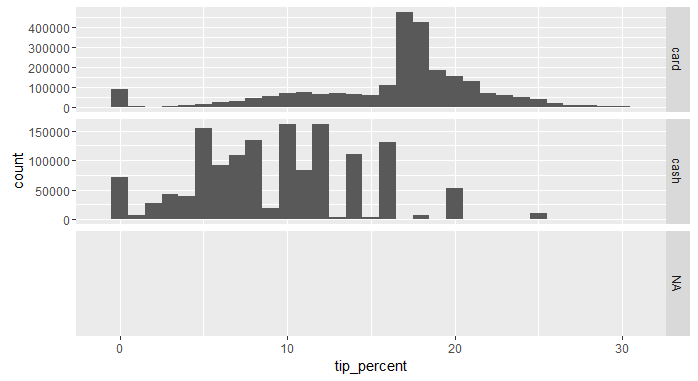
It shouldn't be surprising that the rounding behavior results in a histogram with certain gaps between the bars, especially between the numbers 10 and 20.